Title of Publication The title of 'Doctor Who' had been placed in the top third of the page. The colours that have been used for it, are both grey and white. Used on the black background, helps in order to bring it forward and make it stand out as the combination is well, and is likely to bring attention to the potential customers. In addition to this the font that has been used also conveys the genre of being Sci-Fi, as they have used quite dull colours. Having used the actual title that is used when the show is on, this creates a sense of recognition for the audience because when they see it, they realize that it is familiar to them. With the characters overwriting them, this shows the importance of the them, and brings attention to the magazine, allowing it to get noticed from far away. Again, this creates a sense of recognition as customers are going to want to get something that they are familiar with, and interested in.
Slogan The slogan being used on the front cover of the magazine, is 'Celebrating 50 years of Adventures in space and time'. By writing this on top of the magazine, shows the popularity of Doctor Who, and the fact that it has been running for so long conveys that it has been a success, which is a selling point and is likely to attract customers and make them want to get it. It also is quite catchy, increasing the audience being interested in it.
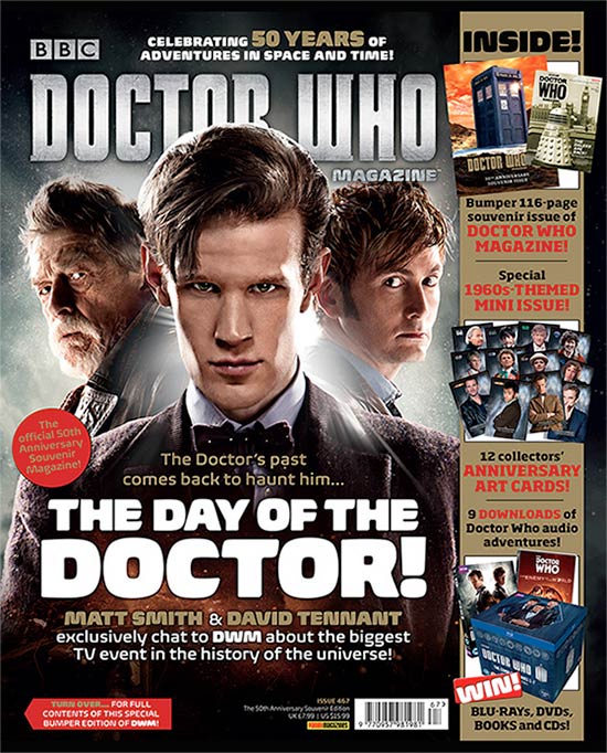
Central Image The Central image on the front cover of this magazine, is the image of the three characters. The lighting that has been used creates a great effect and gives it a magical sort of look, which goes well with the way the serial programme is. In addition to this, the shot that has been used is a medium close up. This has been used in a brilliant way, as the characters are looking at the camera for the picture, and by doing this, brings attention to the customers as it directly addresses them, and is another point that encourages one to purchase it.
Central Image The Central image on the front cover of this magazine, is the image of the three characters. The lighting that has been used creates a great effect and gives it a magical sort of look, which goes well with the way the serial programme is. In addition to this, the shot that has been used is a medium close up. This has been used in a brilliant way, as the characters are looking at the camera for the picture, and by doing this, brings attention to the customers as it directly addresses them, and is another point that encourages one to purchase it.
'Flash' / Cover Lines The different flash lines & cover lines that have been used, such as 'The doctors past comes back to haunt him' and 'The day of the doctor' have both been used in a good way as they are both connected to the central image and again, help to attract customers, making it more of a selling point and making others want to purchase it. The use of white writing on top of a black background, is another way in which they are going to appeal to the audience and are going to make them want to get it.
Free Offers The magazine shows that the customer will recieve anniversary cards, which are for free. As a result of this, customers are most likely going to be attracted to it, as they are going to straight away look at the text written in red, as it is a bright colour which is known for danger, and will stand out more than any of the other writting.
Colour Scheme The magazine cover doesn't consist of many colours on the front cover, however, this does not change the way the audience look at it. As the main colours used on here are Black, Grey, Red and Yellow the colours used on top of the black background is going to stand out the most. As shown the main Doctor Who title has been written in white and grey and most of the writing is white, this on the dark background makes it come forward.
Name/Game Checks These are used in order to make the customer want to buy the magazine, and to make them feel a part of it. On the Doctor Who front cover as shown, it states in white 'Celebrating 50 years of adventures in space and time'. This is likely to grab the attention of the audience, firstly as it is in the top third of the magazine cover, secondly because it has been written in white on a dark background, again making it come forward and stand out.
Language The language that has been used on the front cover is short and snappy and this shows that the BBC have made sure to get straight to the point instead of writing random unnecessary things. The slogans that have been used are short, and these help in order to stick in the audiences mind, allowing them to remember it.
Competition The use of the Blue Rays, Dvd's, Books and Cd's to be 'won' which are shown on the front, again helps in order to attract those that are interested wholly in Doctor Who, or who are obsessed. The way in which they are attracted is because they will want to get the DVD set, and be able to watch it whenever and wherever.
Bar Code The bar code on this magazine front page is in the bottom right side of the page in really small print. The reason that most industries do that is because they know that the price of the magazine that is being offered is for a particularly high amount and writing it in the smallest print possible, will avoid attention being brought to it, and instead of purchasing because of the price, they will be able to purchase it due to the fact that they were attracted to it, which is most important.
Real Target Audience The main target audience for the Doctor Who magazine, is clearly for those that have a huge interest in Doctor Who or those that are interested in the main actor Matt Smith.
No comments:
Post a Comment